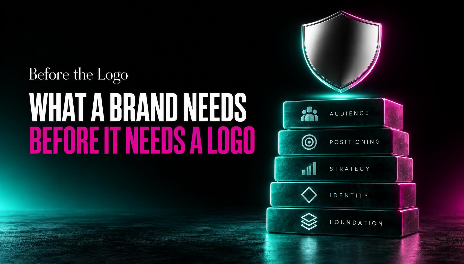
What a Brand Needs Before It Needs a Logo
Most rebrand requests start with a logo. Most of them shouldn't. Here's what to nail down first, and why skipping it costs you later.
Almost every branding conversation we have starts the same way. Someone reaches out and says, we need a new logo. Sometimes it's the first message. Sometimes it's the whole message. And we get why: a logo is the part of a brand you can point at. It's the thing that goes on the van, the invoice, the Instagram bio. It feels like the actual work.
But a logo is a symbol for a decision that hasn't been made yet, and no designer can make that decision for you. We've watched clients go through four, five, six rounds of logo revisions, not because the designer was bad, but because nobody had answered the harder questions first: who is this for, what do we sound like, what do we refuse to do. Without those answers, every logo option looks equally fine and equally wrong.
The logo is the last ten percent
Think of brand identity as a house. The logo is the doorknob. It matters, people touch it every day, but nobody argues about doorknob finishes before the foundation is poured. Most businesses skip straight to the doorknob because it's visible and satisfying to pick from a mood board. The foundation work is slower and less fun: figuring out who you're actually competing with, what your customer complains about most, what you're willing to say no to.
We worked with a mid-size logistics company in Colombo that came to us wanting a rebrand because their old logo, in their words, looked like it was from 2009. It did. But the real problem was that their sales team, their website, and their invoices all described the business differently. One said fast, one said affordable, one said reliable. None of that gets fixed by a new mark. It gets fixed by picking one story and making everything repeat it.
Positioning is a decision, not a description
Positioning gets treated like a summary exercise, as if you just need to describe the business accurately and the positioning appears. It doesn't work that way. Positioning is choosing which true things about your business you're going to lead with, and which true things you're going to let go quiet. A tuition center might genuinely be affordable, well-located, and staffed by strong teachers. Leading with all three at once is how you end up sounding like everyone else's flyer.
We ask clients to write down who they are explicitly not for. This is usually more clarifying than writing down who they are for, because it forces trade-offs. A boutique hotel that says it's for everyone who wants a nice stay hasn't decided anything. A boutique hotel that says it's for couples who want quiet over amenities, and specifically not for large groups or business travelers, suddenly has a brand you can design around.
A brand that tries to be for everyone ends up sounding like it's for no one in particular, which is the most expensive kind of vague.
Voice comes before visuals
Most brand processes we see get the order backwards: pick colors, pick a font, then figure out how to write captions that match. Voice should come first, because it's cheaper to change a sentence than to change a color palette across a hundred templates. Sit down and decide: are we the brand that explains things patiently, or the one that gets straight to the point? Do we use humor, or does that undercut trust for what we sell? Do we say 'you' a lot, or do we mostly talk about ourselves?
Once voice is set, visual decisions get easier because they have a job to do. A confident, no-nonsense voice usually wants a visual system with fewer flourishes and more whitespace. A warm, personal voice can carry hand-drawn touches and softer color choices. When voice and visuals are decided separately by different people at different times, you get a website that reads like one company and looks like another.
The one-page brief that saves everyone weeks
We ask every branding client to fill out a single page before any design work starts. It's short on purpose. If a question takes more than a paragraph to answer, that's usually a sign the business hasn't made the decision yet, which is fine, but it means the design phase should wait.
The one-page brand brief
- Who is the customer, specifically
Not a demographic. A person with a name, a job, and a Tuesday afternoon problem your business solves.
- Who are we not for
Name the customer you'll turn down or underserve on purpose, so the brand can commit to someone.
- What do we want people to feel in the first ten seconds
Relief, excitement, trust, calm. Pick one primary feeling, not a list of adjectives.
- What do we sound like
Three words for tone, plus one thing we never say (too salesy, too formal, too cute).
- What are we willing to give up
Every strong position costs you something. Name the customer or feature you're deprioritizing.
Tap a number to check it off.
That fifth question is the one people skip and the one that matters most. A brand with no trade-offs is a brand with no shape. If your positioning doesn't cost you anything, it probably isn't specific enough to be useful.
Testing it before it's expensive
Once you've drafted the brief, don't test it on your team. Everyone internally already knows the backstory, so they'll fill in gaps automatically. Read your positioning statement to someone outside the business, ideally a stranger who fits your target customer. Ask them what they think you do, who they think it's for, and what they'd expect it to cost. If their answers don't match what you meant, the problem isn't the logo you haven't designed yet. It's the sentence.
This is also the point where you'll notice if two people on your team have different mental models of the business. That's normal, and better to find out now, on a one-page document, than six weeks into a design project when someone says the new logo 'doesn't feel like us' without being able to explain why.
What this means for the actual logo
Once positioning and voice are settled, briefing a designer takes twenty minutes instead of two meetings. You're not asking them to guess what the company means to be. You're asking them to translate a decision you've already made into a visual mark. That's a much smaller, much more solvable problem, and it's why logos designed after this groundwork tend to survive five or ten years instead of getting quietly replaced in eighteen months.
For a small business, a focused day or two is usually enough if the founder is willing to make hard calls. The one-page brief above is meant to be completed in a single sitting, not a months-long workshop.
That disagreement is valuable information. It means the business hasn't actually decided who it's for yet. Resolve it before design starts, not during it, because design revisions are a slow and expensive way to have that argument.
Some can, and it's worth asking upfront whether that's part of the engagement. At Ariviz we usually run a short positioning session before any visual work, specifically to avoid the redesign-after-redesign cycle.