Landing Pages: The Six Blocks That Do the Selling
Most landing pages fail for the same structural reasons. Here are the six sections that actually move a visitor toward buying.
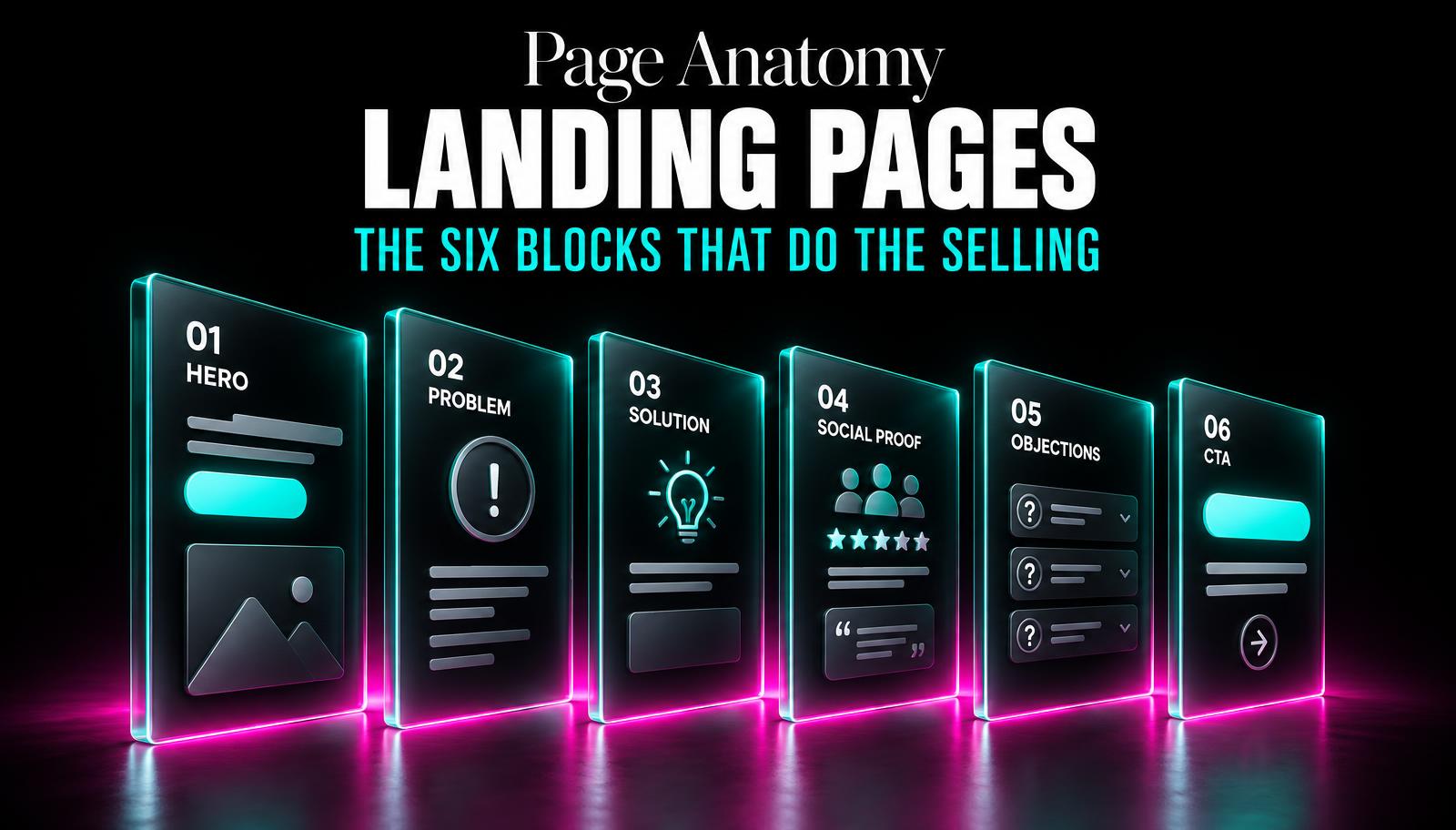
We've rebuilt more landing pages than we can count, and the diagnosis is almost always the same. The page isn't ugly. The colors are fine, the photos are decent, the copy is grammatically correct. It just doesn't sell anything, because it's structured like a company brochure instead of an argument that leads somewhere.
A landing page has one job: convince a stranger, in the time it takes to scroll through it, to take one specific action. Not to learn everything about your company. Not to admire the design. To click one button. Everything on the page should serve that single goal, and the order those pieces appear in matters as much as the words themselves.
Block 1: A headline that passes the five-second test
A visitor lands on your page and, within about five seconds, decides whether to keep reading or hit back. Your headline has to answer two questions in that window: what is this, and is it for me. "Welcome to Horizon Solutions" answers neither. "Bookkeeping for Sri Lankan freelancers, done in one hour a month" answers both.
Specificity is what makes a headline work. Vague headlines feel safe because they're broad enough to apply to anyone, but that breadth is exactly why they fail: nobody feels like it was written for them.
Block 2: The offer, stated plainly
Right under the headline, before any imagery or story, say exactly what you're offering and what it costs the visitor to get it, whether that cost is money, a phone number, or fifteen minutes. Hiding the offer behind clever copy makes visitors work to figure out what you're actually selling, and most won't bother.
Block 3: Proof that's specific, not decorative
"Great service, highly recommend!" as a testimonial does almost nothing, because it could be about anyone and anything. Proof works when it's specific: a name, a real result, a number if you can get one. "Cut our monthly bookkeeping time from six hours to forty minutes" tells a visitor something a five-star icon never will.
If you don't have customer testimonials yet, other proof works too: a client logo, a certification, a before-and-after, a specific process detail that shows competence. The point is specificity, not the format.
A vague testimonial is worse than no testimonial. It tells the visitor you didn't ask a real customer a real question.
Block 4: Handle the objection out loud
Every visitor has a silent reason they might not buy: it's too expensive, it sounds complicated, I've been burned by a similar service before, I don't have time to switch providers. If your page doesn't name and answer that objection, the visitor answers it themselves, and the answer is usually "not now."
This deserves its own section, not a buried line in an FAQ at the very bottom that nobody scrolls to. Name the hesitation directly: "Worried switching accountants mid-year is a headache? We handle the full handover, you don't touch a spreadsheet."
Block 5: A clear next step, described in plain terms
Visitors hesitate more over uncertainty about the process than over the decision itself. "Book a call" is a request. "Book a 15-minute call, no sales pitch, we'll just ask about your current setup and tell you honestly if we're a fit" removes the fear of what happens after clicking. Describe the next three steps after the click, briefly, so there's no unknown left standing between the visitor and the button.
Block 6: One call to action, repeated
Long pages need the same button more than once, but never a different button. A page with "Get a Quote," "Learn More," and "Contact Sales" scattered across it is asking the visitor to make a decision about which decision to make, which is one decision too many. Pick one action, name the button the same thing every time, and place it after every major section.
Building a landing page in this order
- Write the offer first
One sentence: what you're offering, to whom, and what it costs them.
- Draft the headline from the offer
Test it against the five-second rule with someone unfamiliar with your business.
- Gather two to three specific proof points
A number, a name, or a concrete before-and-after beats a generic quote.
- Name the top objection and answer it directly
Ask your sales team or yourself what stops people from saying yes.
- Describe the next steps in plain language
Remove uncertainty about what happens after the click.
- Place one repeated call-to-action button
Same wording, same destination, after each major section.
Tap a number to check it off.
What we usually cut
Most landing pages we inherit have too much, not too little. Full team bios, a history of the company, five different product lines, a blog feed embedded halfway down. All of it dilutes the one argument the page is supposed to make. If a section doesn't move the visitor closer to the single action you picked, it belongs on another page, not this one.
This is uncomfortable for a lot of business owners, because it feels like leaving things out is leaving money on the table. In practice, the opposite is true. A page trying to say everything ends up convincing nobody of anything, and the visitor leaves with a vague impression instead of a clear next step.
Good landing pages aren't clever. They're disciplined. Six blocks, one offer, one action, said plainly enough that a stranger with no context can follow the argument from top to bottom without getting lost or bored along the way.
As long as it needs to be to cover all six blocks properly, and no longer. For a simple, low-cost offer that might be short; for a bigger purchase decision, longer pages with more proof generally convert better.
It can repeat the same one multiple times down the page, but it shouldn't offer two different actions. Competing options usually reduce conversions for both.
Use other specific proof: a demonstrated process, a founder's relevant experience, a guarantee, or early results from a pilot customer, described concretely rather than vaguely.